Home
Home  Navigation


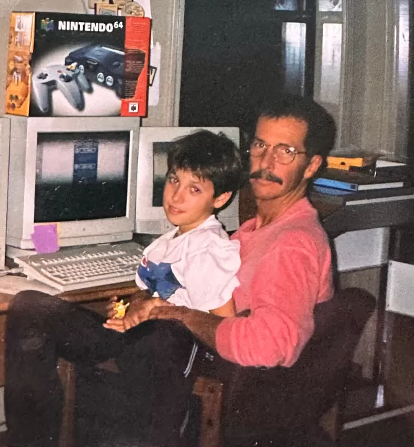

When Nintendo's president calls unexpectedly, you answer immediately. That's precisely what designer Chris Maple did in 1998 when Minoru Arakawa, then president of Nintendo of America, summoned him to their Redmond headquarters.
The Mysterious Meeting That Shaped Gaming History
Maple's Seattle-based design firm Media Design specialized in emergency creative solutions for major clients like Boeing and the Seattle Mariners. Known for discretion despite rarely receiving public credit, his reputation landed him this secretive Nintendo assignment.
"They explained needing a western rebrand for 'Pocket Monsters,'" Maple recalls. "Then a staff member dumped Japanese merchandise on the table - toys, sketches, and promotional materials - asking me to create something called 'Pokémon.'"
The Creative Sprint Behind Gaming's Most Iconic Logo
Tasked with developing the logo in just one month for Pokémon's E3 1998 debut, Maple worked obsessively. "Normally this takes six months," he says. Constrained by Game Boy's limited resolution and coloring, he hand-drafted dozens of concepts before presenting his favorites.
The breakthrough came when Nintendo executives unanimously approved his bold energy-infused design. "There's an undeniable vitality in those letters," Maple reflects. His color choice - vibrant yellow with blue accents - perfectly complemented the forthcoming Pokémon Blue and Yellow editions.
Secrets of the Design Process Revealed
Maple shares rarely-seen artifacts:
- Original pencil sketches showing logo evolution
- Color test sheets evaluating different palettes
- Early vector versions before final tweaks
After launch, Arakawa requested subtle refinements to the "P" and "E" contours - adjustments that created the version now recognized worldwide.
A Lasting Legacy Nearly Forgotten
For decades, Maple remained anonymous - standard practice for logo designers. "I'll never forget seeing that massive Toys R Us display," he laughs. "My daughter would proudly announce I'd designed it while other parents glared."
Now breaking his silence at his family's urging, Maple hopes Nintendo might consult him for Pokémon's upcoming 30th anniversary branding. "This logo carries generational meaning," the designer emphasizes. "Any anniversary treatment deserves careful consideration."
From clandestine corporate meeting to cultural touchstone, Maple's month-long creative burst produced perhaps gaming's most enduring visual identity - a testament to instinctive design brilliance meeting commercial opportunity at precisely the right moment.
 Latest Articles


 Latest Games