Home
Home  Navigation


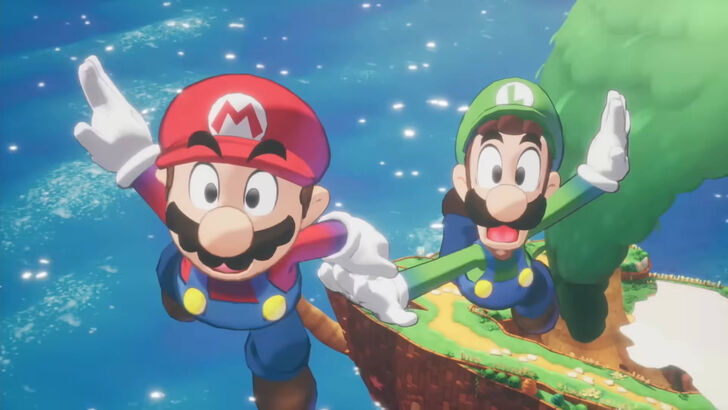
The popular plumber duo, Mario and Luigi, almost got a grittier makeover in their latest game, but Nintendo stepped in to preserve their classic charm. Let's delve into the art direction journey of Mario & Luigi: Brothership.
Exploring Diverse Artistic Styles
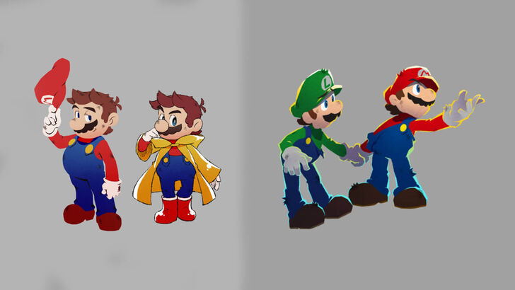
A December 4th Nintendo website article featuring an interview with Acquire, the game's developers, revealed an initial design direction leaning towards a more rugged and edgy aesthetic for Mario and Luigi. However, Nintendo felt this deviated too far from the established characters' identities.
Developers Akira Otani and Tomoki Fukushima (Nintendo) and Haruyuki Ohashi and Hitomi Furuta (Acquire) aimed for 3D visuals that captured the series' unique appeal while differentiating it from other Mario games. This led to experimentation, resulting in a significantly edgier interpretation of the iconic brothers.
Furuta recounted the initial design, laughing, and the subsequent feedback from Nintendo emphasizing the need for a distinctly recognizable Mario & Luigi style. Nintendo provided guidelines defining the core elements of the characters' established visual identity. Furuta admitted initial concerns about whether the edgier design resonated with player expectations.
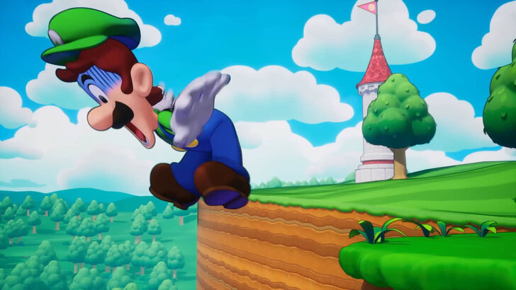
The final art style, according to Furuta, successfully blended the appeal of bold illustrations (solid outlines, striking eyes) with the playful charm of pixel animations. Otani added that while Nintendo encouraged Acquire's unique style, maintaining the essence of Mario was paramount, highlighting a period of balancing both creative visions.
Navigating Development Challenges
Acquire, known for titles like Octopath Traveler and the Way of the Samurai series, typically works on less vibrant, more serious games. Furuta acknowledged the team's natural inclination towards darker RPG aesthetics. Developing a game based on a globally recognized IP also presented unique challenges, as they rarely collaborate on established characters.
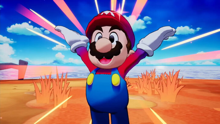
Ultimately, the creative process yielded positive results. The team's decision to prioritize the fun, chaotic nature of the Mario & Luigi series, combined with Nintendo's design insights on visual clarity and accessibility, resulted in a brighter, more user-friendly game world.
 Latest Articles


 Latest Games