Home
Home  Navigation


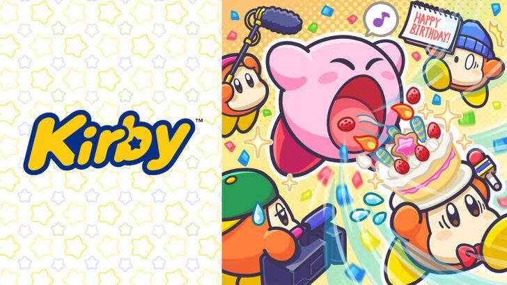
Exploring the Evolution of Kirby's Western Image: From "Angry Kirby" to Global Consistency
This article delves into the fascinating story behind Kirby's differing appearances in US and Japanese marketing, drawing on insights from former Nintendo employees. We'll examine the strategic decisions behind the "Angry Kirby" phenomenon and Nintendo's evolving global localization approach.

The "Angry Kirby" Phenomenon: A Western Marketing Strategy
Kirby's portrayal in Western markets often featured a more determined, even aggressive, expression—a stark contrast to his typically cute Japanese counterpart. Former Nintendo Localization Director, Leslie Swan, clarifies that the goal wasn't to depict anger, but rather to project a sense of determination, appealing to the preferences of Western tween and teen boys who, unlike their Japanese counterparts, were perceived to gravitate towards tougher characters. Shinya Kumazaki, director of Kirby: Triple Deluxe, corroborates this, highlighting the contrasting appeal of cute versus strong Kirby in Japan and the US respectively.
Marketing Kirby as "Super Tuff Pink Puff": Beyond Cuteness
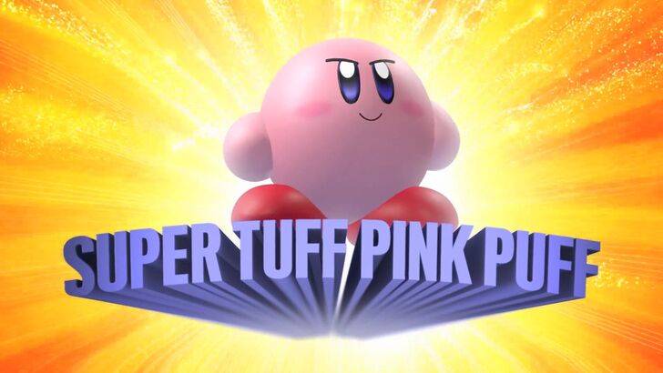
Nintendo's marketing strategy aimed to broaden Kirby's appeal beyond a solely "kiddie" image. The "Super Tuff Pink Puff" tagline for Kirby Super Star Ultra exemplifies this shift. Former Nintendo of America Public Relations Manager, Krysta Yang, reveals the company's desire to shed its "kiddie" label and cultivate a more mature image within the gaming industry. This conscious effort to highlight Kirby's combat abilities aimed to attract an older demographic. While recent marketing emphasizes gameplay and abilities over personality, Kirby's inherent cuteness remains a significant draw, particularly in Japan.
Localization Choices: From Monochrome to Mean Mugshots
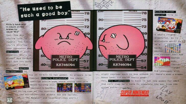
The divergence in Kirby's image between East and West began early, evident in the infamous 1995 "Play It Loud" mugshot advertisement. Subsequent game box art consistently featured Kirby with sharper features and more serious expressions, seen in titles like Kirby: Nightmare in Dream Land, Kirby Air Ride, and Kirby: Squeak Squad. Even the color palette was altered; the original Game Boy release of Kirby's Dreamland presented Kirby in a ghostly white, a consequence of the Game Boy's monochrome display. This early decision, coupled with the perceived need to appeal to a broader Western audience, significantly impacted Kirby's visual presentation.
A Shift Towards Global Consistency
Both Swan and Yang agree that Nintendo has adopted a more unified global approach in recent years. Closer collaboration between Nintendo of America and its Japanese counterpart has led to more consistent marketing and localization strategies. This shift aims to create a unified brand identity across regions, minimizing regional variations like those seen in Kirby's earlier box art. While this fosters brand consistency, Yang acknowledges a potential drawback: the risk of creating bland, generic marketing that fails to resonate with regional nuances. The evolving landscape of globalization and increased familiarity with Japanese culture among Western audiences also contributes to this trend.
 Latest Articles


 Latest Games